Color Wheel
Color harmony is based on the concept of a color wheel. You can study up on the history of it here.
Essentially, it is a wheel with all the colors formed in a circle.
Primary colors are on three equally distanced points of the wheel.
Typically these are Red, Blue and Yellow. In the field of painting,
where the color wheel originated, these three primary colors were used
to mix almost all other colors. In modern printing these are replaced
with Magenta, Cyan and Yellow. Black is thrown in to create darker
colors, thus C, M, Y, K.
Between the three primary colors on the wheel are their mixed
colors—purple between red and blue, orange between red and yellow, green
between yellow and blue. Theoretically, all colors feels somewhere on
the wheel.
The wheel represents color in a circle. Closer to the middle of the
circle, colors are less pure. At the outer edge of the circle, they are
more pure and more saturated. In 3D representations of the color wheel,
one might add darkness and lightness separate from saturation. The thing
that is important to know in color harmony is that how dark or light or
how saturated colors are does not affect their position on the wheel.
Orange can range from a dark brown, to a bright orange to a pale skin
tone. All of these are ORANGE when it comes to the color wheel.
Key Color
After the color wheel itself, the next important thing to understand
is the key color. The key color is the most important color of your
design. It is the color you can’t change or the color of the element you
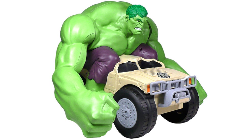
want to draw attention to. If you are doing a painting of the Hulk,
your key color is green as it is the color you can’t change. If you are
doing a photograph of a person, then their skin tone is your key color.
If you are doing product photography, then the color of your product is
the key color.
When determining your color harmony, you need to first determine your
key color. From there, you can look at the various types of harmony and
see which one you like best or which best suits your design.
Types of Harmony
There are 5 types of color harmony:

1) Direct Harmony:
This is the most basic
harmony. It is a point opposite to the key color on the wheel. This
“opposite” color is referred to as the complementary color and thus the
direct harmony can also be called the complementary harmony.
Virtually all color harmonies (except Analogous) are a variation of the
direct harmony. It is the reason the wheel exists as opposed to a
different kind of chart.
The high contrast of complementary colors creates a vibrant look
especially when used at full saturation but can be jarring if not
managed properly. This is the most common color scheme and is easy to
find in all sorts of designs. Hulk’s green color has purple as its
complementary color—which is the reason he wears purple shorts. Red and
green are the Christmas colors and also happen to be complementary
colors to each other. In photography, blue is considered the best color
to put behind a person as it is the complementary color to skin tone.
Complementary color schemes are tricky to use in large doses, but
work well when you want something to stand out. Complementary colors are
really bad for text as both colors have a similar “strength” and will
fight for attention.

2) Split Complementary:
Rather than the point
opposite the key color on the wheel, the split complementary takes the
two colors directly on either side of the complementary color. This
allows for a nicer range of colors while still not deviating from the
basic harmony between the key color and the complementary color.
This color scheme has the same strong visual contrast as the
complementary color scheme, but has less tension. The split
complimentary color scheme is a safe choice for virtually any design as
it is near impossible to mess up and always looks good.

3) Triadic Harmony:
Also called Triadics or Triads.
This refers to the color two spaces to either side of the key color’s
complement. Essentially, with the triadic harmony, you are using three
equally distanced colors on the color wheel. As such, you’re stretching
the basic idea of color harmony and thus this harmony is best used with
only touches of color.
Too much of each color and your design appears to have too many colors and can be too vibrant.
To use a triadic harmony successfully, the colors should be carefully
balanced—let one color dominate and use the two others for accent. Or,
desaturate all your colors and only use the triadic colors in small
spots or touches.

4) Analogous Harmony:
Also referred to as related colors,
these are the colors directly on the left and right of your key
color. They usually match up quite well and create a serene and
comfortable design. While this color harmony can be pleasing to the eye,
it can also come across as monotone. If you are going for a design
that’s primarily one color, this is a good choice.

5) Tetradic Harmony:
Similar to the Triadic,
except that there are four points, all equally distanced on the color
wheel. This is a color harmony I’ve only seen mentioned in more recent
texts on the subject of color harmony. In my earlier post on this subject,
I didn’t even include it. My personal opinion is that a design using
this isn’t really using color harmony and is instead using every color
on the color wheel. Or, where done more subtly, it is a design simply
using two sets of complementary colors.
That being said, this harmony is good when you have numerous elements
that all need to stand out on their own—such as a poster that features 4
or more characters. By using colors equally distant on the color wheel,
each character gets equal attention.